 爱前端网
爱前端网
一、前言
很久之前就了解过CSS3的线性渐变(Linear-Gradient),这段时间决定进一步认知这一特性,以下笔记以便日后查阅。
二、CSS3的各种背景渐变
1. 线性渐变
示例——七彩虹
 ?0?2 ?0?2 ?0?2
代码:
<style type=”text/css”>
.rainbow-linear-gradient{
width: 460px;
height: 160px;
background-image: -webkit-linear-gradient(left,#E50743 0%, #F9870F 15%, #E8ED30 30%, #3FA62E 45%,#3BB4D7 60%,#2F4D9E 75%,#71378A 80%);
background-image: -moz-linear-gradient(left,#E50743 0%, #F9870F 15%, #E8ED30 30%, #3FA62E 45%,#3BB4D7 60%,#2F4D9E 75%,#71378A 80%);
background-image: -o-linear-gradient(left,#E50743 0%, #F9870F 15%, #E8ED30 30%, #3FA62E 45%,#3BB4D7 60%,#2F4D9E 75%,#71378A 80%);
background-image: -ms-linear-gradient(left,#E50743 0%, #F9870F 15%, #E8ED30 30%, #3FA62E 45%,#3BB4D7 60%,#2F4D9E 75%,#71378A 80%);
background-image: linear-gradient(left,#E50743 0%, #F9870F 15%, #E8ED30 30%, #3FA62E 45%,#3BB4D7 60%,#2F4D9E 75%,#71378A 80%);
}
</style>
<div class=”rainbow-linear-gradient”></div>
样式属性:?0?2linear-gradient(起始角度, color stop, color stop[, color stop]*)?0?2
起始角度?0?2,用于设置线性渐变效果的起始角度,值为角度数或预设值。角度数的取值范围是0~365deg,预设值(默认值为top)的取值范围是[left,right,top,bottom,center,top right,top left,bottom left,bottom right,left center,right center]。(注意:IE10只能取[left,top],Chrome则没有[center,left center,right center])。
color stop?0?2,用于设置颜色边界,color为边界的颜色;stop为该边界的位置,stop的值为像素数值或百分比数值,若为百分比且小于0%或大于100%则表示该边界位于可视区域外。两个?0?2color stop?0?2之间的区域为颜色过渡区,颜色将从靠左的边界的颜色线性渐变为靠右的边界的颜色。
?0?22. 放射性渐变
示例——七彩虹球

代码:
<style type=”text/css”>
.rainbow-radial-gradient{
width: 160px;
height: 160px;
background-image: -webkit-radial-gradient(center,#E50743 0%, #F9870F 15%, #E8ED30 30%, #3FA62E 45%,#3BB4D7 60%,#2F4D9E 75%,#71378A 80%);
background-image: -moz-radial-gradient(center,#E50743 0%, #F9870F 15%, #E8ED30 30%, #3FA62E 45%,#3BB4D7 60%,#2F4D9E 75%,#71378A 80%);
background-image: -o-radial-gradient(center,#E50743 0%, #F9870F 15%, #E8ED30 30%, #3FA62E 45%,#3BB4D7 60%,#2F4D9E 75%,#71378A 80%);
background-image: -ms-radial-gradient(center,#E50743 0%, #F9870F 15%, #E8ED30 30%, #3FA62E 45%,#3BB4D7 60%,#2F4D9E 75%,#71378A 80%);
background-image: radial-gradient(center,#E50743 0%, #F9870F 15%, #E8ED30 30%, #3FA62E 45%,#3BB4D7 60%,#2F4D9E 75%,#71378A 80%);
}
</style> <div class=”rainbow-radial-gradient”></div>
样式属性:?0?2radial-gradient(圆心坐标, 渐变形状 渐变大小, color stop, color stop[, color stop]*)?0?2
圆心坐标?0?2,用于设置放射的圆形坐标,可设置为形如10px 20px的?0?2x-offset y-offset?0?2,或使用预设值center(默认值)。
渐变形状?0?2,取值范围为预设值circle(圆形)和ellipse(椭圆形,默认值)。
渐变大小?0?2,取值范围为如下预设值
closest-side 或 contain?0?2,以距离圆心最近的边的距离作为渐变半径。
closest-corner?0?2,以距离圆心最近的角的距离作为渐变半径。
farthest-side?0?2,以距离圆心最远的边的距离作为渐变半径。
farthest-corner 或 cover?0?2,以距离圆心最远的角的距离作为渐变半径。
3. 重复线性渐变
示例——重复的彩虹

代码:
<style type=”text/css”>
.rainbow-repeating-linear-gradient{
width: 460px;
height: 160px;
background-image: -webkit-repeating-linear-gradient(left,#E50743 0%, #F9870F 5%, #E8ED30 10%, #3FA62E 15%,#3BB4D7 20%,#2F4D9E 25%,#71378A 30%);
background-image: -moz-repeating-linear-gradient(left,#E50743 0%, #F9870F 5%, #E8ED30 10%, #3FA62E 15%,#3BB4D7 20%,#2F4D9E 25%,#71378A 30%);
background-image: -o-repeating-linear-gradient(left,#E50743 0%, #F9870F 5%, #E8ED30 10%, #3FA62E 15%,#3BB4D7 20%,#2F4D9E 25%,#71378A 30%);
background-image: -ms-repeating-linear-gradient(left,#E50743 0%, #F9870F 5%, #E8ED30 10%, #3FA62E 15%,#3BB4D7 20%,#2F4D9E 25%,#71378A 30%);
background-image: repeating-linear-gradient(left,#E50743 0%, #F9870F 5%, #E8ED30 10%, #3FA62E 15%,#3BB4D7 20%,#2F4D9E 25%,#71378A 30%);
}
</style> <div class=”rainbow-repeating-linear-gradient”></div>
样式属性:?0?2repeating-linear-gradient(起始角度, color stop, color stop[, color stop]*)?0?2
各配置项的意思和取值规范均与linear-gradient一样。唯一区别在于最后一个colo stop所配置的颜色并不会作为元素剩余部分的背景色,而是不断重复整个线性渐变处理。
4. 重复放射性渐变
示例——重复的彩虹球

代码:
<style type=”text/css”>
.rainbow-repeating-radial-gradient{
width: 160px;
height: 160px;
background-image: -webkit-repeating-radial-gradient(center,#E50743 0%, #F9870F 5%, #E8ED30 10%, #3FA62E 15%,#3BB4D7 20%,#2F4D9E 25%,#71378A 30%);
background-image: -moz-repeating-radial-gradient(center,#E50743 0%, #F9870F 5%, #E8ED30 10%, #3FA62E 15%,#3BB4D7 20%,#2F4D9E 25%,#71378A 30%);
background-image: -o-repeating-radial-gradient(center,#E50743 0%, #F9870F 5%, #E8ED30 10%, #3FA62E 15%,#3BB4D7 20%,#2F4D9E 25%,#71378A 30%);
background-image: -ms-repeating-radial-gradient(center,#E50743 0%, #F9870F 5%, #E8ED30 10%, #3FA62E 15%,#3BB4D7 20%,#2F4D9E 25%,#71378A 30%);
background-image: repeating-radial-gradient(center,#E50743 0%, #F9870F 5%, #E8ED30 10%, #3FA62E 15%,#3BB4D7 20%,#2F4D9E 25%,#71378A 30%);
}
</style> <div class=”rainbow-repeating-radial-gradient”></div>
样式属性:?0?2repeating-radial-gradient(圆心坐标, 渐变形状 渐变大小, color stop, color stop[, color stop]*)
各配置项的意思和取值规范均与radial-gradient一样。
5. 背景渐变模式
将上述四种渐变效果混合就可以创造各种背景渐变模式了!国外CSS高手的设计:http://lea.verou.me/css3patterns/
示例

代码:
<style type=”text/css”>
.bg{
width: 260px;
height: 260px;
/* 设置多个渐变背景图, 使用逗号分隔 */
background-image:radial-gradient(transparent 10%, #ccc 15%, #ccc 20%, transparent 100%),radial-gradient(35px 35px, transparent 10%, #aaa 15%, #aaa 20%, transparent 100%);
background-color: #eee;
background-size: 60px 60px,80px 80px;
</style>
<div class=”bg”></div>
这里用到CSS3的新特性——Multiple Background Image和background-size属性。
三、IE5.5~9的背景渐变
由于IE5.5~9不支持CSS3的渐变特性,因此需要使用IE滤镜进行处理,而且IE的渐变滤镜仅提供从left到right,和从top到bottom的线性渐变效果,并且只能是设置为两种颜色的过渡效果而已。?0?2
滤镜格式:?0?2filter:progid:DXImageTransfer.Microsoft.gradient([startcolorstr=’起始颜色’|startcolor=起始颜色数值],[endcolorstr=’结束颜色’|endcolor=结束颜色数值],GradientType=渐变类型)?0?2
GradientType?0?2,取值范围——0(默认值,表示从top到bottom渐变),1(表示从left到right渐变)。
startcolor 和 endcolor?0?2,值为十进制的整数,取值范围0~4294967295(由startcolorstr和endcolorstr的十六进制值转换而来)。
startcolorstr 和 endcolorstr?0?2,值格式为#AARRGGBB,其中AA为透明度的十六进制表示形式,其余则为RGB的十六进制表示形式,endcolorstr的默认值为#FF000000,startcolorstr的默认值为#FF0000FF。
四、SVG的背景渐变
SVG可谓是我最期待的新特性。下面了解一下SVG下的背景渐变。
线性渐变示例——彩虹

代码:
<?xml version=”1.0″?> <!DOCTYPE svg PUBLIC “-//W3C//DTD SVG 1.1//EN” “http://www.w3.org/Graphics/SVG/1.1/DTD/svg11.dtd”>
<svg width=”100%” height=”100%” version=”1.1″ xmlns=”http://www.w3.org/2000/svg”>
<defs>
<linearGradient id=”linear-gradient” x1=”0%” y1=”0%” x2=”100%” y2=”0%”>
<stop offset=”0%” style=”stop-color:#E50743;”/>
<stop offset=”15%” style=”stop-color:#F9870F;”/>
<stop offset=”30%” style=”stop-color:#E8ED30;”/>
<stop offset=”45%” style=”stop-color:#3FA62E;”/>
<stop offset=”60%” style=”stop-color:#3BB4D7;”/>
<stop offset=”75%” style=”stop-color:#2F4D9E;”/>
<stop offset=”80%” style=”stop-color:#71378A;”/>
</linearGradient>
</defs>
<ellipse cx=”90″ cy=”60″ rx=”85″ ry=”55″ style=”fill:url(#linear-gradient)”/>
</svg>?0?2
线性滤镜的SVG标签为?0?2linearGradient?0?2 ,其中?0?2×1 和 y1?0?2为渐变的起始位移,?0?2×2 和 y2?0?2为渐变的结束位移。而?0?2stop标签?0?2则用于设置颜色边界。
其他元素通过?0?2fill:url(#滤镜ID)?0?2来应用该滤镜。
?0?2放射性渐变示例——彩虹

代码:
<?xml version=”1.0″?> <!DOCTYPE svg PUBLIC “-//W3C//DTD SVG 1.1//EN” “http://www.w3.org/Graphics/SVG/1.1/DTD/svg11.dtd”>
<svg width=”100%” height=”100%” version=”1.1″ xmlns=”http://www.w3.org/2000/svg”> <defs>
<radialGradient id=”radial-gradient” cx=”50%” cy=”50%” r=”50%” fx=”50%” fy=”50%”>
<stop offset=”0%” style=”stop-color:#E50743;”/>
<stop offset=”15%” style=”stop-color:#F9870F;”/>
<stop offset=”30%” style=”stop-color:#E8ED30;”/>
<stop offset=”45%” style=”stop-color:#3FA62E;”/>
<stop offset=”60%” style=”stop-color:#3BB4D7;”/>
<stop offset=”75%” style=”stop-color:#2F4D9E;”/>
<stop offset=”80%” style=”stop-color:#71378A;”/>
</radialGradient>
</defs>
<circle cx=”360″ cy=”90″ r=”85″ style=”fill:url(#radial-gradient)”/>
</svg>
放射性滤镜的SVG标签为?0?2radialGradient?0?2,其中?0?2cx 和 cy?0?2为圆心位移,?0?2r?0?2?0?2为渐变半径,?0?2fx 和 fy?0?2为内圈范围。
注意:滤镜linearGradient和radialGradient均不能应用到非SVG元素上。
未经允许不得转载:爱前端网 » CSS3魔法堂:背景渐变(Gradient)
 程序猿必备的10款web前端动画插件十四
 程序猿必备的10款web前端动画插件十三
 2018年十大轻量级的CSS框架为构建快速网站
 程序猿必备的9款web前端动画插件十二
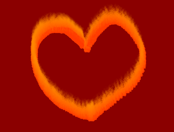 程序猿必备的9款web前端动画插件十一
 程序猿必备的14款web前端动画插件十
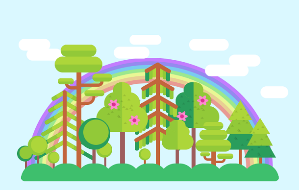 程序猿必备的8款web前端动画插件九
 程序猿必备的12款web前端动画插件八
 基于Splitting.js的CSS3魔幻文字动画特效
 React 3D层叠卡片切换动画
 SVG带小图标的Checkbox美化插件
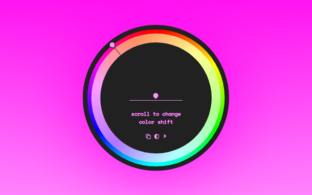 Vue.js 圆形CSS3渐变色拾取器