 爱前端网
爱前端网
概述
上一篇我们重点介绍了组件的创建、注册和使用,熟练这几个步骤将有助于深入组件的开发。另外,在子组件中定义props,可以让父组件的数据传递下来,这就好比子组件告诉父组件:“嘿,老哥,我开通了一个驿站,你把东西放到驿站我就可以拿到了。”
今天我们将着重介绍slot和父子组件之间的访问和通信,slot是一个非常有用的东西,它相当于一个内容插槽,它是我们重用组件的基础。Vue的事件系统独立于原生的DOM事件,它用于组件之间的通信。
本文的主要内容如下:
- 组件的编译作用域
- 在组件template中使用<slot>标签作为内容插槽
- 使用$children, $refs, $parent 实现父子组件之间的实例访问
- 在子组件中,使用$dispatch向父组件派发事件;在父组件中,使用$broadcast向子组件传播事件
- 结合这些基础知识,我们一步一步实现一个CURD的示例
Demo和源代码已放到GitHub,如果您觉得本篇内容不错,请点个赞,或在GitHub上加个星星!
编译作用域
尽管使用组件就像使用一般的HTML元素一样,但它毕竟不是标准的HTML元素,为了让浏览器能够识别它,组件会被解析为标准的HTML片段,然后将组件的标签替换为该HTML片段。
<div id="app">
<my-component>
</my-component>
</div>
<template id="myComponent">
<div>
<h2>{{ msg }}</h2>
<button v-on:click="showMsg">Show Message</button>
</div>
</template>
<script src="js/vue.js"></script>
<script>
new Vue({
el: ‘#app’,
components: {
‘my-component’: {
template: ‘#myComponent’,
data: function() {
return {
msg: ‘This is a component!’
}
},
methods: {
showMsg: function() {
alert(this.msg)
}
}
}
}
})
这段代码定义了一个my-component组件,<my-component><my-component>不是标准的HTML元素,浏览器是不理解这个元素的。
那么Vue是如何让浏览器理解<my-component><my-component>标签的呢?(下图是我个人的理解)

在创建一个Vue实例时,除了将它挂载到某个HTML元素下,还要编译组件,将组件转换为HTML片段。
除此之外,Vue实例还会识别其所挂载的元素下的<my-component>标签,然后将<my-component>标签替换为HTML片段。
实际上浏览器仍然是不理解<my-component>标签的,我们可以通过查看源码了解到这一点。

组件在使用前,经过编译已经被转换为HTML片段了,组件是有一个作用域的,那么组件的作用域是什么呢?
你可以将它理解为组件模板包含的HTML片段,组件模板内容之外就不是组件的作用域了。
例如,my-component组件的作用域只是下面这个小片段。

组件的模板是在其作用域内编译的,那么组件选项对象中的数据也应该是在组件模板中使用的。
考虑下面的代码,在Vue实例和组件的data选项中分别追加一个display属性:
new Vue({
el: ‘#app’,
data: {
display: true
},
components: {
‘my-component’: {
template: ‘#myComponent’,
data: function() {
return {
msg: ‘This is a component!’,
display: false
}
},
methods: {
showMsg: function() {
alert(this.msg)
}
}
}
}
})
然后在my-component标签上使用指令v-show=”display”,这个display数据是来源于Vue实例,还是my-component组件呢?
<div id="app">
<my-component v-show="display">
</my-component>
</div>
答案是Vue实例。
至此,我们应该认识到组件的作用域是独立的:
父组件模板的内容在父组件作用域内编译;子组件模板的内容在子组件作用域内编译
通俗地讲,在子组件中定义的数据,只能用在子组件的模板。在父组件中定义的数据,只能用在父组件的模板。如果父组件的数据要在子组件中使用,则需要子组件定义props。
使用Slot
为了让组件可以组合,我们需要一种方式来混合父组件的内容与子组件自己的模板。这个处理称为内容分发,Vue.js 实现了一个内容分发 API,使用特殊的 <slot> 元素作为原始内容的插槽。
如果不理解这段话,可以先跳过,你只要知道<slot>元素是一个内容插槽。
单个Slot
下面的代码在定义my-component组件的模板时,指定了一个<slot></slot>元素。
<div id="app">
<my-component>
<h1>Hello Vue.js!</h1>
</my-component>
<my-component>
</my-component>
</div>
<template id="myComponent">
<div class="content">
<h2>This is a component!</h2>
<slot>如果没有分发内容,则显示slot中的内容</slot>
<p>Say something…</p>
</div>
</template>
<script src="js/vue.js"></script>
<script>
Vue.component(‘my-component’, {
template: ‘#myComponent’
})
new Vue({
el: ‘#app’
})
</script>
这段代码运行结果如下:
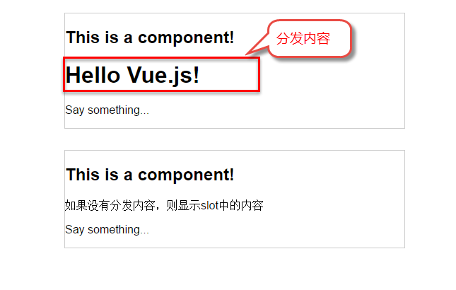
第一个<my-component>标签有一段分发内容<h1>Hello Vue.js!</h1>,渲染组件时显示了这段内容。
第二个<my-component>标签则没有,渲染组件时则显示了slot标签中的内容。
指定名称的slot
上面这个示例是一个匿名slot,它只能表示一个插槽。如果需要多个内容插槽,则可以为slot元素指定name属性。
多个slot一起使用时,会非常有用。例如,对话框是HTML常用的一种交互方式。
在不同的运用场景下,对话框的头部、主体内容、底部可能是不一样的。

这时,使用不同名称的slot就能轻易解决这个问题了。
<template id="dialog-template">
<div class="dialogs">
<div class="dialog" v-bind:class="{ ‘dialog-active’: show }">
<div class="dialog-content">
<div class="close rotate">
<span class="iconfont icon-close" @click="close"></span>
</div>
<slot name="header"></slot>
<slot name="body"></slot>
<slot name="footer"></slot>
</div>
</div>
<div class="dialog-overlay"></div>
</div>
</template>
<script src="js/vue.js"></script>
<script>
Vue.component(‘modal-dialog’, {
template: ‘#dialog-template’,
props: [‘show’],
methods: {
close: function() {
this.show = false
}
}
})
new Vue({
el: ‘#app’,
data: {
show: false
},
methods: {
openDialog: function() {
this.show = true
},
closeDialog: function() {
this.show = false
}
}
})
</script>
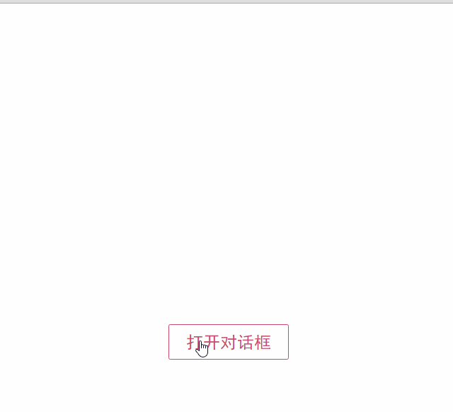
在定义modal-dialog组件的template时,我们使用了3个slot,它们的name特性分别是header、body和footer。
在<modal-dialog>标签下,分别为三个元素指定slot特性:
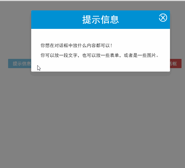
<div id="app">
<modal-dialog v-bind:show.sync="show">
<header class="dialog-header" slot="header">
<h1 class="dialog-title">提示信息</h1>
</header>
<div class="dialog-body" slot="body">
<p>你想在对话框中放什么内容都可以!</p>
<p>你可以放一段文字,也可以放一些表单,或者是一些图片。</p>
</div>
<footer class="dialog-footer" slot="footer">
<button class="btn" @click="closeDialog">关闭</button>
</footer>
</modal-dialog>
<button class="btn btn-open" @click="openDialog">打开对话框</button>
</div>
对话框的标题内容、主体内容、底部内容,完全由我们自定义,而且这些内容就是一些简单的HTML元素!
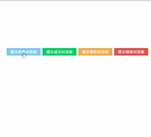
如果需要定制对话框的样式,我们只需要在<modal-dialog>上追加一个v-bind指令,让它绑定一个class。
<modal-dialog v-bind:show.sync=”show” v-bind:class=”dialogClass”>
然后修改一下Vue实例,在data选项中追加一个dialogClass属性,然后修改openDialog()方法:
new Vue({
el: ‘#app’,
data: {
show: false,
dialogClass: ‘dialog-info’
},
methods: {
openDialog: function(dialogClass) {
this.show = true
this.dialogClass = dialogClass
},
closeDialog: function() {
this.show = false
}
}
})
虽然我们在modal-dialog组件中定义了3个slot,但是在页面中使用它时,并不用每次都指定这3个slot。
比如,有时候我们可能只需要header和body:
<modal-dialog v-bind:show.sync="show" v-bind:class="dialogClass">
<header class="dialog-header" slot="header">
<h1 class="dialog-title">提示信息</h1>
</header>
<div class="dialog-body" slot="body">
<p>你想在对话框中放什么内容都可以!</p>
<p>你可以放一段文字,也可以放一些表单,或者是一些图片。</p>
</div>
</modal-dialog>
现在看到的对话框是没有底部的,只有标题和主体内容。
多个slot同时使用的场景还有很多,例如:用户的注册、登录、找回密码等这些表单集合,也可以用一个组件来完成。
父子组件之间的访问
有时候我们需要父组件访问子组件,子组件访问父组件,或者是子组件访问根组件。
针对这几种情况,Vue.js都提供了相应的API:
- 父组件访问子组件:使用$children或$refs
- 子组件访问父组件:使用$parent
- 子组件访问根组件:使用$root
$children示例
下面这段代码定义了3个组件:父组件parent-component,两个子组件child-component1和child-component2。
在父组件中,通过this.$children可以访问子组件。
this.$children是一个数组,它包含所有子组件的实例。
<div id="app">
<parent-component></parent-component>
</div>
<template id="parent-component">
<child-component1></child-component1>
<child-component2></child-component2>
<button v-on:click="showChildComponentData">显示子组件的数据</button>
</template>
<template id="child-component1">
<h2>This is child component 1</h2>
</template>
<template id="child-component2">
<h2>This is child component 2</h2>
</template>
<script src="js/vue.js"></script>
<script>
Vue.component(‘parent-component’, {
template: ‘#parent-component’,
components: {
‘child-component1’: {
template: ‘#child-component1’,
data: function() {
return {
msg: ‘child component 111111’
}
}
},
‘child-component2’: {
template: ‘#child-component2’,
data: function() {
return {
msg: ‘child component 222222’
}
}
}
},
methods: {
showChildComponentData: function() {
for (var i = 0; i < this.$children.length; i++) {
alert(this.$children[i].msg)
}
}
}
})
new Vue({
el: ‘#app’
})
</script>

$refs示例
组件个数较多时,我们难以记住各个组件的顺序和位置,通过序号访问子组件不是很方便。
在子组件上使用v-ref指令,可以给子组件指定一个索引ID:
<template id="parent-component">
<child-component1 v-ref:cc1></child-component1>
<child-component2 v-ref:cc2></child-component2>
<button v-on:click="showChildComponentData">显示子组件的数据</button>
</template>
在父组件中,则通过$refs.索引ID访问子组件的实例:
showChildComponentData: function() {
alert(this.$refs.cc1.msg);
alert(this.$refs.cc2.msg);
}
$parent示例
下面这段代码定义了两个组件:child-component和它的父组件parent-component。
在子组件中,通过this.$parent可以访问到父组件的实例。
<div id="app">
<parent-component></parent-component>
</div>
<template id="parent-component">
<child-component></child-component>
</template>
<template id="child-component">
<h2>This is a child component</h2>
<button v-on:click="showParentComponentData">显示父组件的数据</button>
</template>
<script src="js/vue.js"></script>
<script>
Vue.component(‘parent-component’, {
template: ‘#parent-component’,
components: {
‘child-component’: {
template: ‘#child-component’,
methods: {
showParentComponentData: function() {
alert(this.$parent.msg)
}
}
}
},
data: function() {
return {
msg: ‘parent component message’
}
}
})
new Vue({
el: ‘#app’
})
</script>

注意:尽管可以访问父链上任意的实例,不过子组件应当避免直接依赖父组件的数据,尽量显式地使用 props 传递数据。另外,在子组件中修改父组件的状态是非常糟糕的做法,因为:
1.这让父组件与子组件紧密地耦合;
2. 只看父组件,很难理解父组件的状态。因为它可能被任意子组件修改!理想情况下,只有组件自己能修改它的状态。
自定义事件
有时候我们希望触发父组件的某个事件时,可以通知到子组件;触发子组件的某个事件时,可以通知到父组件。
Vue 实例实现了一个自定义事件接口,用于在组件树中通信。这个事件系统独立于原生 DOM 事件,用法也不同。
每个 Vue 实例都是一个事件触发器:
- 使用 $on() 监听事件;
- 使用 $emit() 在它上面触发事件;
- 使用 $dispatch() 派发事件,事件沿着父链冒泡;
- 使用 $broadcast() 广播事件,事件向下传导给所有的后代。
派发事件
下面这段代码是一个简单的事件派发处理
<div id="app">
<p>Messages: {{ messages | json }}</p>
<child-component></child-component>
</div>
<template id="child-component">
<input v-model="msg" />
<button v-on:click="notify">Dispatch Event</button>
</template>
<script src="js/vue.js"></script>
<script>
// 注册子组件
Vue.component(‘child-component’, {
template: ‘#child-component’,
data: function() {
return {
msg: ”
}
},
methods: {
notify: function() {
if (this.msg.trim()) {
this.$dispatch(‘child-msg’, this.msg)
this.msg = ”
}
}
}
})
// 初始化父组件
new Vue({
el: ‘#app’,
data: {
messages: []
},
events: {
‘child-msg’: function(msg) {
this.messages.push(msg)
}
}
})
</script>
我们将这个示例分为几个步骤解读:
- 子组件的button元素绑定了click事件,该事件指向notify方法
- 子组件的notify方法在处理时,调用了$dispatch,将事件派发到父组件的child-msg事件,并给该该事件提供了一个msg参数
- 父组件的events选项中定义了child-msg事件,父组件接收到子组件的派发后,调用child-msg事件。

运行结果如下:

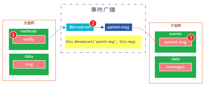
广播事件
下面这段代码是一个简单的事件广播处理
<div id="app">
<input v-model="msg" />
<button v-on:click="notify">Broadcast Event</button>
<child-component></child-component>
</div>
<template id="child-component">
<ul>
<li v-for="item in messages">
父组件录入了信息:{{ item }}
</li>
</ul>
</template>
<script src="js/vue.js"></script>
<script>
// 注册子组件
Vue.component(‘child-component’, {
template: ‘#child-component’,
data: function() {
return {
messages: []
}
},
events: {
‘parent-msg’: function(msg) {
this.messages.push(msg)
}
}
})
// 初始化父组件
new Vue({
el: ‘#app’,
data: {
msg: ”
},
methods: {
notify: function() {
if (this.msg.trim()) {
this.$broadcast(‘parent-msg’, this.msg)
}
}
}
})
</script>
我们将这个示例分为几个步骤解读:
- 父组件的button元素绑定了click事件,该事件指向notify方法
- 父组件的notify方法在处理时,调用了$broadcast,将事件派发到子组件的parent-msg事件,并给该该事件提供了一个msg参数
- 子组件的events选项中定义了parent-msg事件,子组件接收到父组件的广播后,调用parent-msg事件。
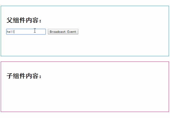
运行结果如下:
CURD示例
Vue.js组件的API来源于三部分——prop,slot和事件。
-
prop 允许外部环境传递数据给组件;
-
事件 允许组件触发外部环境的 action;
-
slot 允许外部环境插入内容到组件的视图结构内。
至此,这三部分我都已经介绍完了,接下来我就用这些知识来教大家一步一步完成一个CURD示例。
第1步——创建表格组件,添加查询和删除功能
创建表格组件,添加过滤,数据删除功能
<div id="app">
<div class="container">
<div class="form-group">
<label>Search</label>
<input type="text" class="search-input" v-model="searchQuery" />
</div>
</div>
<div class="container">
<simple-grid :data-list="people" :columns="columns" :search-key="searchQuery">
</simple-grid>
</div>
</div>
<template id="grid-template">
<table>
<thead>
<tr>
<th v-for="col in columns">
{{ col.name | capitalize}}
</th>
<th>
Delete
</th>
</tr>
</thead>
<tbody>
<tr v-for="(index,entry) in dataList | filterBy searchKey">
<td v-for="col in columns">
{{entry[col.name]}}
</td>
<td class="text-center">
<button @click="deleteItem(index)">delete</button>
</td>
</tr>
</tbody>
</table>
</template>
<script src="../js/vue.js"></script>
<script>
Vue.component(‘simple-grid’, {
template: ‘#grid-template’,
props: [‘dataList’, ‘columns’, ‘searchKey’],
methods: {
deleteItem: function(index) {
this.dataList.splice(index, 1);
},
}
})
var demo = new Vue({
el: ‘#app’,
data: {
searchQuery: ”,
columns: [{
name: ‘name’
}, {
name: ‘age’
}, {
name: ‘sex’
}],
people: [{
name: ‘Jack’,
age: 30,
sex: ‘Male’
}, {
name: ‘Bill’,
age: 26,
sex: ‘Male’
}, {
name: ‘Tracy’,
age: 22,
sex: ‘Female’
}, {
name: ‘Chris’,
age: 36,
sex: ‘Male’
}]
}
})
</script>
![20[3]](http://images2015.cnblogs.com/blog/341820/201607/341820-20160703121643359-73772709.gif "20[3]")
使用知识点
1. 使用Vue.component语法糖
Vue.component是创建并注册组件的语法糖,使用Vue.component注册的组件是全局的。
2. 使用prop将父组件数据传递给子组件
#app元素是父组件,simple-grid是子组件。
在simple-grid组件中定义选项props: [‘dataList’, ‘columns’, ‘searchKey’]
在#app下使用<simple-grid :data-list=”people” :columns=”columns” :search-key=”searchQuery”> 将数据传递给simple-grid组件
3. 使用过滤器
{{ col.name | capitalize}}使用了capitalize过滤器,将字符串的首字母转换为大写后输出。
filterBy filterKey使用了filterBy过滤器,根据指定条件过滤数组元素,filterBy返回过滤后的数组。
4. 使用数组索引别名
数组默认的索引名称为$index,v-for=”(index,entry) in dataList使用了数组索引别名。
括号中的第一个参数index是$index的别名,第二个参数是遍历的数组元素。
5. 使用了v-bind和v-on指令的缩写
<simple-grid :data-list=”people” :columns=”columns” :search-key=”searchQuery”> 使用了v-bind指令的缩写。
:data-list是v-bind:data-list的缩写,:columns是v-bind:columns的缩写,:search-key是v-bind:search-key的缩写。
<button @click=”deleteItem(index)”>delete</button> 使用了v-on指令的缩写,@click是v-on:click的缩写。
第2步——创建对话框组件
表格数据的添加和修改,我们使用模态对话框来实现。
模态对话框有两种模式,新建模式和修改模式,分别用于新建一条数据和修改指定的数据。
由于对话框的内容来源于具体的数据,所以我们可以考虑将对话框作为simple-grid组件的一个子组件。
modal-dialog组件的模板内容:
<template id="dialog-template">
<div class="dialogs">
<div class="dialog" v-bind:class="{ ‘dialog-active’: show }">
<div class="dialog-content">
<header class="dialog-header">
<h1 class="dialog-title">{{ title }}</h1>
</header>
<footer class="dialog-footer">
<div class="form-group">
<label></label>
<button v-on:click="save">Save</button>
<button v-on:click="close">Close</button>
</div>
</footer>
</div>
</div>
<div class="dialog-overlay"></div>
</div>
</template>
modal-dialog组件在simple-grid组件中注册:
Vue.component(‘simple-grid’, {
// …已省略
data: function() {
return {
mode: 0,
item: {}
}
},
components: {
‘modal-dialog’: {
template: ‘#dialog-template’,
data: function() {
return {
// 对话框默认是不显示的
show: false
}
},
/*
* mode = 1是新增数据模式,mode = 2是修改数据模式
* title表示对话框的标题内容
* fields表示对话框要显示的数据字段数组
* item是由simple-dialog传下来,用于绑定表单字段的
*/
props: [‘mode’, ‘title’, ‘fields’, ‘item’],
methods: {
close: function() {
this.show = false
},
save: function() {
}
}
}
}
// …已省略
})
由于modal-dialog组件是simple-grid的子组件,所以它应该在simple-grid的template中使用:
<template id="grid-template">
<!–…前面的内容已省略 –>
<modal-dialog :mode="mode" :title="title" :fields="columns" :item="item">
</modal-dialog>
<!–…后面的内容已省略 –>
</template>
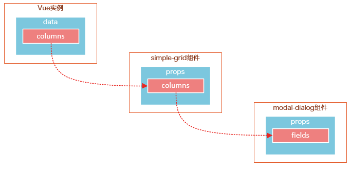
modal-dialog组件的props选项,追加了3个元素:
- title表示对话框的标题内容
- fields表示对话框要显示的数据字段数组
- item用于绑定表单字段,它是一个对象
注意:由于modal-dialog是一个子组件,它仅用于simple-grid组件的新增或修改模式,所以modal-dialog的template没有使用<slot>元素
使用知识点
1. 使用组件的局部注册
modal-dialog组件没有使用Vue.component进行全局注册,使用simple-grid组件components选项实现了局部注册。
2. 使用组件的data选项
组件的data选项必须以函数的方式返回。
第3步——实现数据新建功能

1. 修改Vue实例的data选项的columns:
var demo = new Vue({
// …已省略
columns: [{
name: ‘name’,
isKey: true
}, {
name: ‘age’
}, {
name: ‘sex’,
dataSource: [‘Male’, ‘Female’]
}]
// …已省略
})
为’name’列追加一个isKey属性,并设置为true,表示该列为主键列。
为’sex’列追加一个dataSoruce属性,并设置为[‘Male’, ‘Female’],表示新增或修改数据时选择性别的下拉框数据源。
2. 修改modal-dialog的template:
<template id="dialog-template">
<div class="dialogs">
<div class="dialog" v-bind:class="{ ‘dialog-active’: show }">
<div class="dialog-content">
<header class="dialog-header">
<h1 class="dialog-title">{{ title }}</h1>
</header>
<div v-for="field in fields" class="form-group" >
<label>{{ field.name }}</label>
<select v-if="field.dataSource" v-model="item[field.name]">
<option v-for="opt in field.dataSource" :value="opt">{{ opt }}</option>
</select>
<input v-else type="text" v-model="item[field.name]">
</div>
<footer class="form-group">
<label></label>
<button v-on:click="save">Save</button>
<button v-on:click="close">Close</button>
</footer>
</div>
</div>
<div class="dialog-overlay"></div>
</div>
</template>
在modal-dialog组件的模板中遍历fields,然后显示field的名称。
在渲染表单时,根据是否有dataSource判定表单是下拉框还是文本框。
(由于示例较为简陋,所以只提供了input和select两种表单类型)
注意modal-dialog组件的fields是由Vue实例传递给simple-grid,然后再由simple-grid传递过来的。
3. 修改simple-grid的template
<template id="grid-template">
<!–…已省略 –>
<div class="container">
<button class="btn" @click="openNewItemDialog(‘Create new item’)">Create</button>
</div>
<modal-dialog :mode="mode" :title="title" :fields="columns" :item="item" v-on:create-item="createItem">
</modal-dialog>
</template>
添加一个Create按钮,绑定click事件到openNewItemDiaolog()方法,该方法用于打开modal-dialog组件,并将模式设置为新建模式。
在<modal-dialog>标签上给sample-grid绑定一个自定义事件create-item,后面在$dispatch派发事件时会用到。
4. 修改simple-grid的methods选项
Vue.component(‘simple-grid’, {
// …已省略
methods: {
openNewItemDialog: function(title) {
// 对话框的标题
this.title = title
// mode = 1表示新建模式
this.mode = 1
// 初始化this.item
this.item = {}
// 广播事件,showDialog是modal-dialog组件的一个方法,传入参数true表示显示对话框
this.$broadcast(‘showDialog’, true)
},
createItem: function() {
// 将item追加到dataList
this.dataList.push(this.item)
// 广播事件,传入参数false表示隐藏对话框
this.$broadcast(‘showDialog’, false)
// 新建完数据后,重置item对象
this.item = {}
},
deleteItem: function(index) {
this.dataList.splice(index, 1);
},
},
// …已省略
})
追加了两个方法:opeNewItemDialog和createItem方法。
opeNewItemDialog方法用于打开对话框,this.$broadcast(‘showDialog’, true) 调用子组件modal-dialog的showDialog事件,传入参数true表示显示对话框。
createItem方法用于保存新建的数据,this.$broadcast(‘showDialog’, false) 调用子组件modal-dialog的showDialog事件,传入参数false表示隐藏对话框。
5. 修改modal-grid的methods和events选项
Vue.component(‘simple-grid’, {
// …已省略
components: {
‘modal-dialog’: {
// …已省略
methods: {
close: function() {
this.show = false
},
save: function() {
//新建模式
if (this.mode === 1){
// 使用$dispatch调用simple-grid的create-item方法
this.$dispatch(‘create-item’)
}
}
},
events: {
// 显示或隐藏对话框
‘showDialog’: function(show) {
this.show = show
}
}
}
}
// …已省略
})
修改methods选项的save方法,由于保存按钮是在子组件modal-dialog中的,而createItem方法是在父组件simple-grid中的,所以这里使用this.$dispatch(‘create-item’) 派发到父组件的自定义事件create-item。
追加events选项,添加showDialog事件,用于显示或隐藏对话框。
请将4和5结合起来看,我们既用到了$broadcast广播事件,又用到了$dispatch派发事件。
下面这幅图有助于理解simple-grid和modal-dialog组件之间的通信:
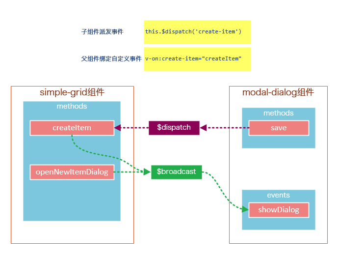
create-item是一个自定义事件,由子组件modal-dialog调用this.$dispatch(‘create-item’) 派发到自定义事件create-item,自定义事件create-item是绑定在父组件simple-grid上的,该事件会执行createItem方法。
第4步——实现数据修改功能

1. 修改sample-grid的template
<template id="grid-template">
<!–…已省略–>
<tbody>
<tr v-for="(index,entry) in dataList | filterBy searchKey">
<td v-for="col in columns">
<span v-if="col.isKey"><a href="javascript:void(0)" @click="openEditItemDialog(index, ‘Edit item ‘ + entry[col.name])">{{entry[col.name]}}</a></span>
<span v-else>{{entry[col.name]}}</span>
</td>
</tr>
</tbody>
<!–…已省略–>
<modal-dialog
:mode="mode"
:title="title"
:item="item"
:fields="columns"
v-on:create-item="createItem"
v-on:update-item="updateItem">
</modal-dialog>
</template>
遍历列表数据时,使用v-if指令判断当前列是否为主键列,如果是主键列,则给主键列添加链接,然后给链接绑定click事件,click事件用于打开修改数据的对话框。
在<modal-dialog>标签上,给sample-grid绑定自定义事件update-item,update-item事件指向sample-grid的方法updateItem。
2. 修改modal-dialog的template
<div v-for="field in fields" class="form-group">
<label>{{ field.name }}</label>
<select v-if="field.dataSource" v-model="item[field.name]" :disabled="mode === 2 && field.isKey">
<option v-for="opt in field.dataSource" :value="opt">{{ opt }}</option>
</select>
<input v-else type="text" v-model="item[field.name]" :disabled="mode === 2 && field.isKey">
</div>
在修改模式下(mode = 2),如果当前字段是主键字段,则禁止修改。
3. 修改sample-grid的methods选项
// 弹出修改数据的对话框时,使用对象的深拷贝
initItemForUpdate: function(p) {
var c = c || {};
for (var i in p) {
// 属性i是否为p对象的自有属性
if (p.hasOwnProperty(i)) {
if (typeof p[i] === ‘object’) {
c[i] = Array.isArray(p[i]) ? [] : {}
deepCopy(p[i], c[i])
} else {
// 属性是基础类型时,直接拷贝
c[i] = p[i]
}
}
}
return c;
},
findItemByKey: function(key){
var keyColumn = this.keyColumn
for(var i = 0; i < this.dataList.length; i++){
if(this.dataList[i][keyColumn] === key){
return this.dataList[i]
}
}
},
createItem: function() {
// 将item追加到dataList
this.dataList.push(this.item)
// 广播事件,传入参数false表示隐藏对话框
this.$broadcast(‘showDialog’, false)
// 新建完数据后,重置item对象
this.item = {}
},
updateItem: function() {
// 获取主键列
var keyColumn = this.keyColumn
for (var i = 0; i < this.dataList.length; i++) {
// 根据主键查找要修改的数据,然后将this.item数据更新到this.dataList[i]
if (this.dataList[i][keyColumn] === this.item[keyColumn]) {
for (var j in this.item) {
this.dataList[i][j] = this.item[j]
}
break;
}
}
// 广播事件,传入参数false表示隐藏对话框
this.$broadcast(‘showDialog’, false)
// 修改完数据后,重置item对象
this.item = {}
}
追加的内容:调用内置的ready()函数,openEditDialog、updateItem、findItemByKey和initItemForUpdate方法。
ready()函数会在编译结束和$el 第一次插入文档之后调用,你可以将其理解为jQuery中的document.ready()。
在ready()函数中,初始化keyColumn,keyColumn表示主键列,调用updateItem方法时,会根据主键数据找到dataList中匹配的元素。
opeEditItemDialog方法用于打开对话框,this.$broadcast(‘showDialog’, true) 调用子组件modal-dialog的showDialog事件,传入参数true表示显示对话框。
ready()函数没有特别的业务逻辑,主要是获取主键列,调用updateItem方法时,会根据主键数据找到dataList中匹配的元素。
updateItem方法用于保存修改的数据,this.$broadcast(‘showDialog’, false) 调用子组件modal-dialog的showDialog事件,传入参数false表示隐藏对话框。
initItemForUpdate方法用于将选中的数据this.dataList[index]深拷贝到this.item。为什么要使用深拷贝呢?因为this.dataList[index]是一个引用对象,它有一些属性也是引用类型的,如果使用浅拷贝可能得到一些超出预期的效果。

4.修改modal-dialog的methods选项
save: function() {
//新建模式
if (this.mode === 1) {
// 使用$dispatch调用simple-grid的create-item事件
this.$dispatch(‘create-item’)
}else if(this.mode === 2){
// 使用$dispatch调用simple-grid的update-item事件
this.$dispatch(‘update-item’)
}
}
修改methods选项中的save方法,this.mode === 2时,将事件派发到父组件的update-item事件。
第5步——修改数据新建功能

修改sample-grid的methods选项,追加itemExists方法,然后修改createItem方法。
itemExists: function(keyColumn) {
for (var i = 0; i < this.dataList.length; i++) {
if (this.item[keyColumn] === this.dataList[i][keyColumn])
return true;
}
return false;
},
createItem: function() {
var keyColumn = this.getKeyColumn()
if (!this.itemExists(keyColumn)) {
// 将item追加到dataList
this.dataList.push(this.item)
// 广播事件,传入参数false表示隐藏对话框
this.$broadcast(‘showDialog’, false)
// 新建完数据后,重置item对象
this.item = {}
} else {
alert(keyColumn + ‘ "’ + this.item[keyColumn] + ‘" is already exists’)
}
}
由于主键列数据是不能重复的,所以在新增数据时需要判断主键列数据是否已经存在。
总结
说到底,组件的API主要来源于以下三部分:
- prop 允许外部环境传递数据给组件;
- 事件 允许组件触发外部环境的 action;
- slot 允许外部环境插入内容到组件的视图结构内。
这三大知识点在上下两篇文章中都体现出来了,限于篇幅和个人知识的匮乏,我并不能将组件的所有特性都描述出来,这还需要靠各位花一些时间去多多了解官网的API,并付诸实践。
如果要构建一些大型的应用,基于组件的开发模式是一个不错的选择,我们将整个系统拆分成一个一个小组件,就像乐高一样,然后将这些组件拼接起来。
未经允许不得转载:爱前端网 » Vue.js——60分钟组件快速入门
 Vue.js 圆形CSS3渐变色拾取器
 Vue.js任务列表 可本地存储任务数据
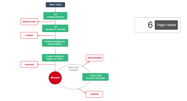 Vue.js流程图插件 可自定义流程节点事件
 Vue.js实现的3D Tab菜单
 Vue.js折线图表插件 支持数据分组统计
 HTML5 3D地球仪 可按经纬坐标定位
 JavaScript 动画折线图 带阴影 3D 效果
 纯CSS3实现的无限级垂直手风琴菜单
 基于Splitting.js的CSS3魔幻文字动画特效
 React 3D层叠卡片切换动画
 SVG带小图标的Checkbox美化插件